


This article describes the types of data you can analyze using the Main Dashboard.
The Main Dashboard is the ultimate solution for connecting your eCommerce platform with your marketing data in real-time from one convenient location. With this powerful Growth Intelligence enhancer, you will have the insight and data you need to maximize the impact of your business and drive growth.
The Main Dashboard provides essential transaction, revenue, Contact, and pageview analytics. Use it to streamline your eCommerce operations, make informed decisions, and potentially re-allocate resources.
To access the Dashboard, go to
Start → Dashboard → Main tab
Contents
1. Getting started
The SALESmanago platform allows you to gather and analyze transaction, revenue, Contact, pageview, and other data using convenient analytical panels referred to as dashboards.
Read more about the SALESmanago Business Dashboards >>
The Dashboard is the analytical panel you can see right after logging into your account, on the start screen. It provides quick access to the most essential business analytics. To understand how useful it can prove to you, see section 3 of this article.
At the top of the start screen, you can switch between the various analytical dashboards existing on your account, including any dashboards you have created and configured yourself. To change the name of a dashboard or delete it, or to change the tab order, click Manage dashboards [1] in the top right-hand corner of the screen:

A set of icons will appear next to each tab [1].

Click the move icon to move the selected tab to another position; the pencil icon, to change the tab’s name; and the trash can icon, to delete the selected dashboard.
When you have finished editing, click Done [2] to hide the edit icons.
You can also add a new dashboard and select the widgets it will contain. To do so, click + New dashboard in the top right-hand corner of the screen and enter the name for your new dashboard (you can always edit it later). After clicking Create, you will be redirected to the widget library, where you can select the elements you want to include in your new dashboard and arrange them in the order most convenient to you.
Read more about creating a new dashboard and about the widget library >>
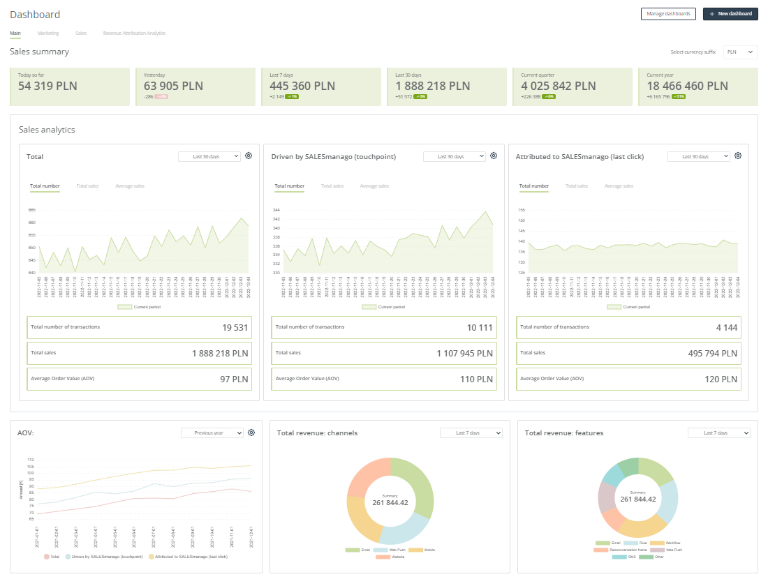
Below the dashboard tabs, you can see all the widgets included in the Main Dashboard. They are in the form of large tiles that contain charts and data highlights.
For most tiles, the option to change the chart type is available. To achieve this, click on the settings icon in the top right-hand corner of a tile.
Most tiles also allow you to select the time range for which the data are to be displayed. Just open the drop-down menu on the selected tile and choose one of the available options.
For some widgets (sometimes depending on the settings), you can also see an indication of any upward or downward trends observed by the system.
The trends are expressed in two ways:
- figures—accompanied by a plus or minus sign, they allow you to compare your results based on actual numbers.
- percentages—accompanied by an arrow that points upwards or downwards, they allow you to compare your results based on percentages.
TIP: You don’t need to pay much attention to drops noted for short periods of time (e.g., for the previous day). Long-term data (e.g., for the last 30 days) are much more indicative.
The trends are calculated based on the following comparisons:
- The results for yesterday are compared to the results for the day before yesterday.
- The results for the last 7 days (today excluded) are compared to the results for the preceding 7 days.
- The results for the last 30 days (today excluded) are compared to the results for the preceding 30 days.
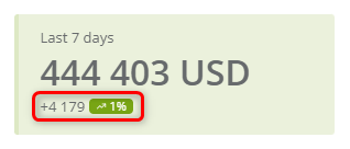
EXAMPLE: Today is January 6. The tile below shows that over the last 7 days (December 30 to January 5), you earned 445,360 USD. This is 2,149 USD more than what you earned from December 23 to December 29, which is an increase of approx. 1%.
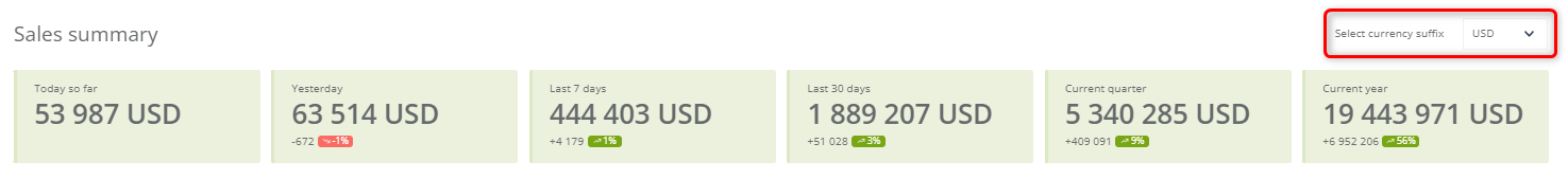
Start your work with the Dashboard by personalizing it with the correct currency. Use the drop-down list to select the currency suffix [1] you want to see on the Dashboard’s tiles:
All analytics widgets comprising the Dashboard are described in detail in section 2. below.
2. Analytics widgets
This section explains how to read the analytics widgets contained in the Dashboard.
A. Sales summary
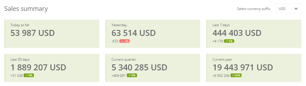
The Sales summary section allows you to easily check how much revenue your business generated over various time periods, as indicated on individual tiles. The data displayed in this section comes from External Events transferred to the SALESmanago system via API or through SALESmanago integration plugins.
Each tile shows your total revenue for a different time period, which are as follows:
- today so far—revenue earned from 12:00 a.m. (midnight) up to the current time;
- yesterday—total revenue earned yesterday;
- last 7 days—total revenue earned over the last 7 days excluding today;
- last 30 days—total revenue earned over the last 30 days excluding today;
- current quarter—revenue earned so far in the current quarter, including today;
- current year—revenue earned so far in the current year, including today.
The amounts are accompanied by the currency suffix of your choice. On some tiles, you can also see an indication of any upward or downward trends observed by the system. To understand how to read the trend indicators, see section 1 above.
B. Sales analytics
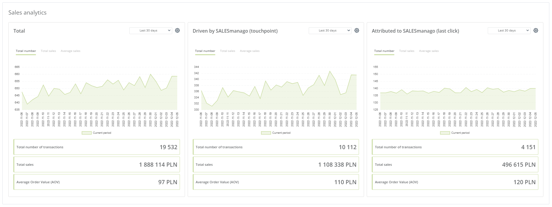
The Sales analytics section allows you to check the total number of transactions closed and the total revenue achieved within the selected time range, as well as the average order value (AOV) during this period. In addition to the figures, the widgets include charts that conveniently visualize trends occurring over days or months.
The Sales analytics section is made up of three very similar widgets:
- Total—shows the total revenue generated by your business in the selected period, calculated based on External Events transferred to SALESmanago via API or through SALESmanago integration plugins.
- Driven by SALESmanago (touchpoint)—shows the total revenue from all transactions transferred to the SALESmanago system in which the Contact was exposed to a marketing activity performed via SALESmanago at least once during their last 25 interactions with your marketing communications, within 90 days preceding the purchase.
- EXAMPLE: A Contact receives a newsletter with product recommendations. They click on a button and visit your website but do not make a purchase. Three days later, the same Contact directly visits your website and purchases a previously viewed product. This is a SALESmanago-driven purchase.
- Attributed to SALESmanago (last click)—shows the total revenue from all transactions in which the Contact’s last touchpoint before the actual transaction was any marketing activity performed via SALESmanago.
- EXAMPLE: A Contact receives a newsletter with product recommendations. They click a button, visit your website, and make a purchase.
Each of the three Sales analytics widgets has the same structure:
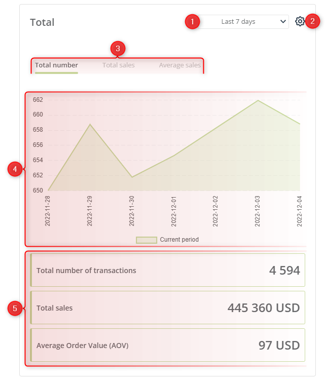
[1] Time range—select the time period for which you want to display the results.
[2] Settings—here you can change the chart type (line or bar).
[3] Data displayed on the chart—switch between these tabs to display different data sets on the chart below:
- total number of transactions in the selected period,
- total sales (revenue) in the selected period,
- the AOV in the selected period.
[4] Chart—a visual representation of your results, allowing you to conveniently track trends over days or months.
[5] Transaction figures—here you can see the exact figures showing the total number of transactions, the total sales (revenue), and the AOV in the selected time period.
The Sales Analytics widgets are also excellent comparison tools. If you want to compare the results for the selected period with those for the corresponding previous period, open the settings menu and select the option Compare with previous period.
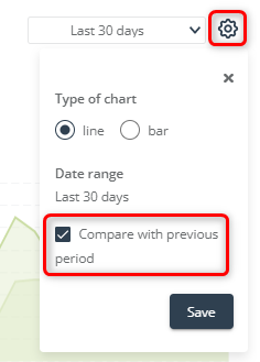
Click Save. Depending on the chart type, a new line or a new set of bars will appear, representing the results obtained in the corresponding previous period:
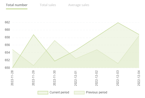
If you select the option Compare with previous period, trend indications will appear for each figure presented below the chart:
The trends are expressed as figures and percentages. To understand how to read these trend indications, see section 1.—Getting started.
TIP: Click either of the legend labels below the chart to hide the corresponding part of the chart. For instance, by clicking on Current period, you can hide the results for the current period and display only the results for the previous period:
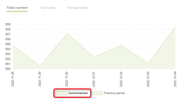
To display the hidden results again, just click on the crossed-out legend label.
C. Average order value (AOV)
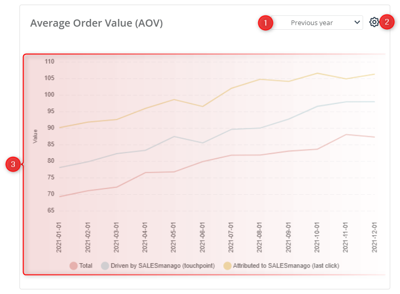
[1] Time range—select the time period for which you want to display the AOV data.
[2] Settings—here you can change the chart type (line or bar).
[3] Chart—a visual representation of the AOV over days or months (depending on the option selected in point [1] above), allowing you to track trends conveniently. In addition to the data for all transactions (Total), the chart shows data for transactions driven by and attributed to SALESmanago (for an explanation of these terms, see section 2.B above).
TIP: Click any of the legend labels below the chart to hide the corresponding part of the chart. For instance, by clicking on Driven by SALESmanago (touchpoint), you can hide the results for transactions driven by SALESmanago:
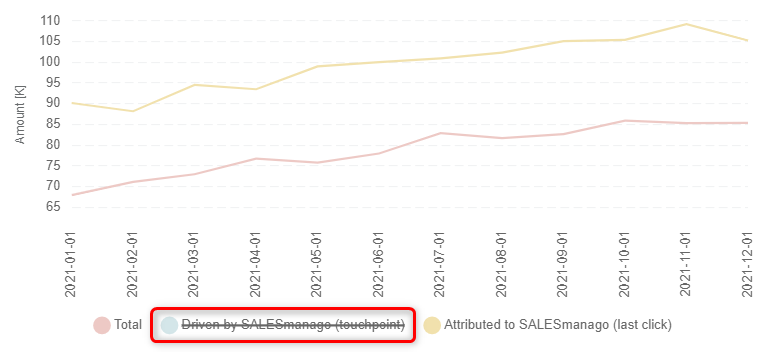
To display the hidden results again, just click on the crossed-out legend label.
D. Total Sales: Channels
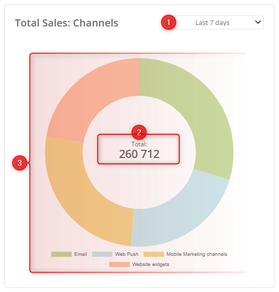
[1] Time range—select the time period for which you want to display the data.
[2] Total—the total revenue generated through the channels shown in the chart. The figure includes sales both driven by and attributed to SALESmanago.
[3] Chart—a visual representation of sales driven by and attributed to SALESmanago, allowing you to evaluate the effectiveness of your campaigns run through the various channels and identify areas for improvement.
TIP: Click any of the legend labels below the chart to hide the corresponding part of the chart. For instance, by clicking on Web Push, you can hide the chart element visualizing the revenue generated through the Web Push channel:
Note that the total in the center will change, too.
To display the hidden results again, just click on the crossed-out legend label.
E. Total Sales: Features
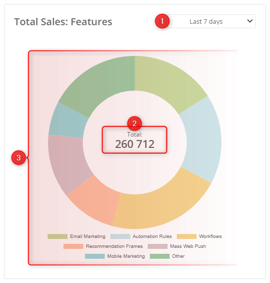
[1] Time range—select the time period for which you want to display the data.
[2] Total—the total revenue from the features shown on the chart.
[3] Chart—a visual representation of what part of the SALESmanago-driven sales was generated by each of the features shown in the chart. These data allow you to evaluate the effectiveness of your campaigns run using various features and identify areas for improvement.
TIP: If you click on either of the legend labels below the chart, you can hide the corresponding part of the chart. For instance, by clicking on Automation rules and Workflow, you can hide the chart elements visualizing the revenue generated through Automation Rules and Workflows:
Note that the total in the center will change, too.
To display the hidden results again, just click on the crossed-out legend label.
F. Customer Retention Analytics
This section has four parts:
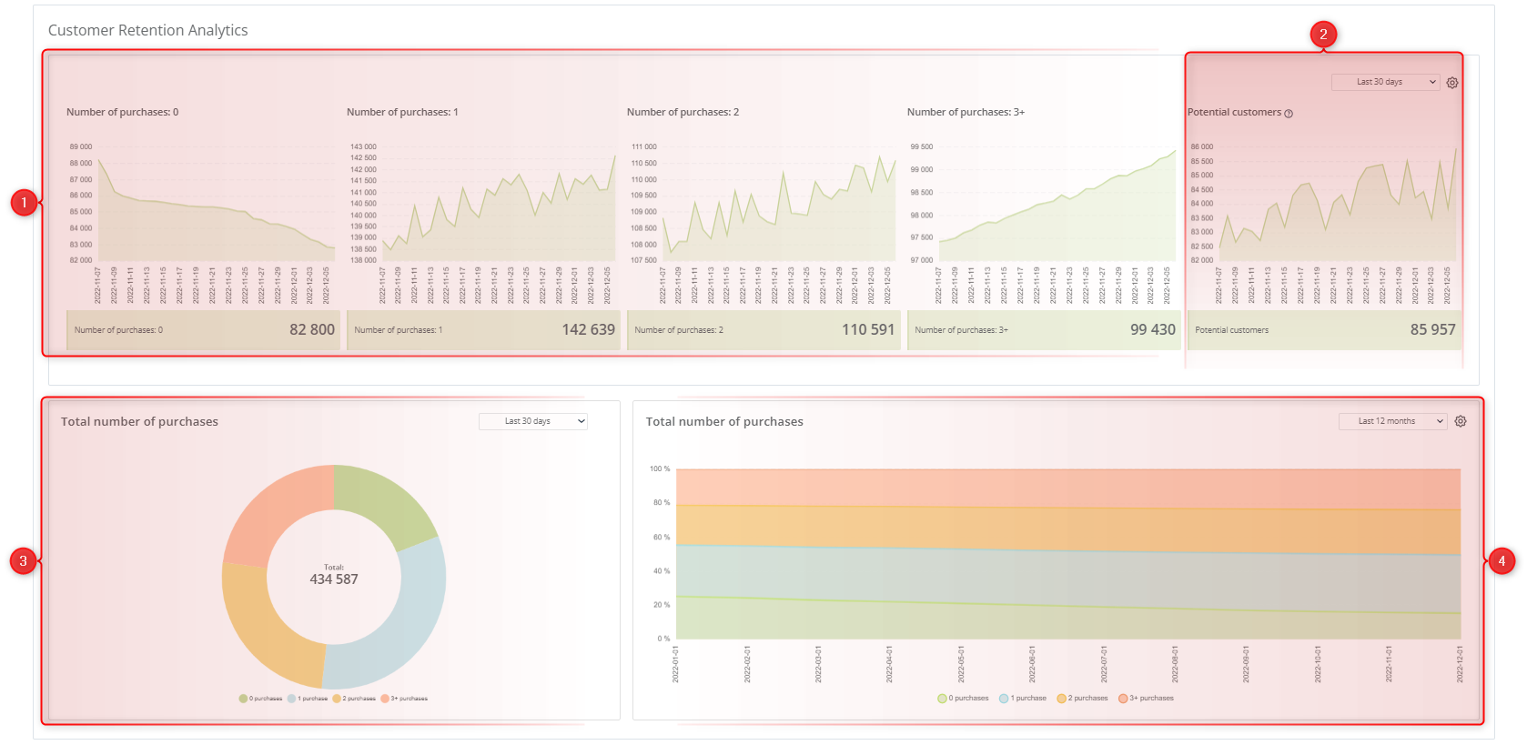
Each part contains one or more charts presenting data related to the number of purchases by individual customers.
[1] Customers by number of purchases—these charts show how many Contacts have made the indicated number of purchases since being added to your database.
[2] Potential customers—this chart shows Contacts who have never made a purchase but have at least one CART event (not followed by a PURCHASE event).
[3] Donut chart—a visualization of how many Contacts have made the indicated number of purchases since being added to your database, providing a quick overview of your current database statistics.
[4] Area chart (line or bar)—a visualization of how many Contacts have made the indicated number of purchases since being added to your database, allowing you to track trends over time.
TIP: Click any legend label below the chart to hide the corresponding chart element. Note that the total shown in the center of the donut chart will change, too.
G. Contact analysis

[1] Settings—here you can change the chart type (line or bar).
[2] Data displayed on the chart—switch between these tabs to display data for all Contacts or only new Contacts on the chart below.
[3] Chart—a visual representation of your results, allowing you to conveniently track trends in the number of Contacts over the last week.
[4] Transaction figures—here you can see the exact figures showing the total number of your Contacts, the Contacts acquired yesterday, and the Contacts acquired over the last 7 days (excluding today).
H. Pageviews
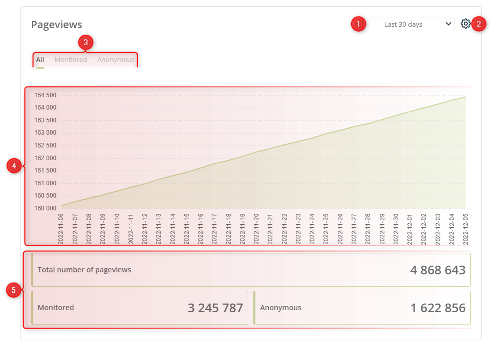
[1] Time range—select the time period for which you want to display the data.
[2] Settings—here you can change the chart type (line or bar).
[3] Data displayed on the chart—switch between these tabs to display different data sets on the chart below (for the period selected in point [1]):
- total number of pageviews by both monitored and anonymous Contacts,
- number of pageviews by monitored Contacts,
- number of pageviews by anonymous Contacts.
[4] Chart—a visual representation of your results, allowing you to conveniently track trends in the number of pageviews over the selected period.
[5] Transaction figures—here you can see the exact figures showing the total pageviews, pageviews by monitored Contacts, and pageviews by anonymous Contacts in the selected period.
I. Real time events on the website
This widget allows you to track website visits and transactions (External Events: PURCHASE) by order of recency.

[1] Data set—select whether on the list below you want to see:
- website visits by monitored Contacts,
- website visits by anonymous Contacts, or
- transactions
—all by order of recency.
[2] Event list—here you can see the essential details for the data set selected in point [1] above. The contents of the list vary depending on the tab selected.
- Visits of monitored Contacts—this list presents the visit date, the email address and name of the visiting Contact, and the visit scoring (calculated based on your settings in Menu → Automation Processes → Automation Rules → Scoring rules).
- Visits of anonymous Contacts—this list includes the visit date, an indication that the visitor is anonymous, the name of the visitor’s Internet Service Provider (ISP), if identified, and the visit scoring (calculated based on your settings in Menu → Automation Processes → Automation Rules → Scoring rules).
- Transactions—this list presents the transaction (PURCHASE) date, the email address and name of the purchaser, the purchase value, and the number of purchased products.
Additionally, the right-most column allows you to view the 360° profile of the Contact whom the event concerns (see point [5] below).
[3] Filters—click here to narrow down the list of events. You can filter events by Contact owner, Event date, and minimum visit scoring.
You can clear applied filters by opening the filter menu again and selecting the option Clear filters.
[4] Export—click this button to export a dataset. The exact function of this button depends on the tab selected in point [1] above. For instance, to export External Events, select the Transactions tab; to export anonymous Contacts, select the Visits of anonymous Contacts tab.
When you click Export, a new window will appear. Define the time range [A] for which Contacts or External Events are to be exported.

Then click Export [B] to download a CSV file (it will be available in the Repository shortly).
[5] 360° profile—irrespective of the tab selected in point [1] above, the right-most column always offers the option to view the 360° profile of the Contact who visited your website or made a purchase.
- In the case of Visits of monitored Contacts, when you click the 360° profile button for a selected visit, a new window will open.
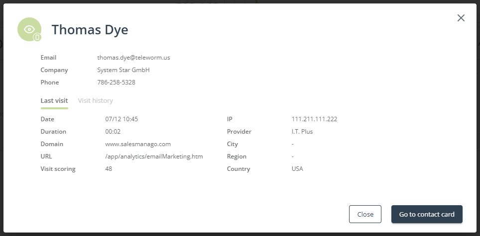
In addition to an extract from the visitor’s Contact Card, which presents the most important data about the visiting Contact, the window contains two tabs: Last visit and Visit history. The former is where you can check details about the Contact’s most recent visit to your website, such as date, visit duration, and IP address. The latter is where you can see a list of the most recent visits, along with their essential details.
- In the case of Visits of anonymous Contacts, when you click the 360° profile button for a selected visit, a new window will open. The window contains two tabs: Last visit and Visit history (similar to the case of Visits of monitored Contacts).
- In the case of Transactions, when you click the 360° profile button for a selected transaction, you will be redirected to the Contact Card of the purchaser.
J. Recent campaigns
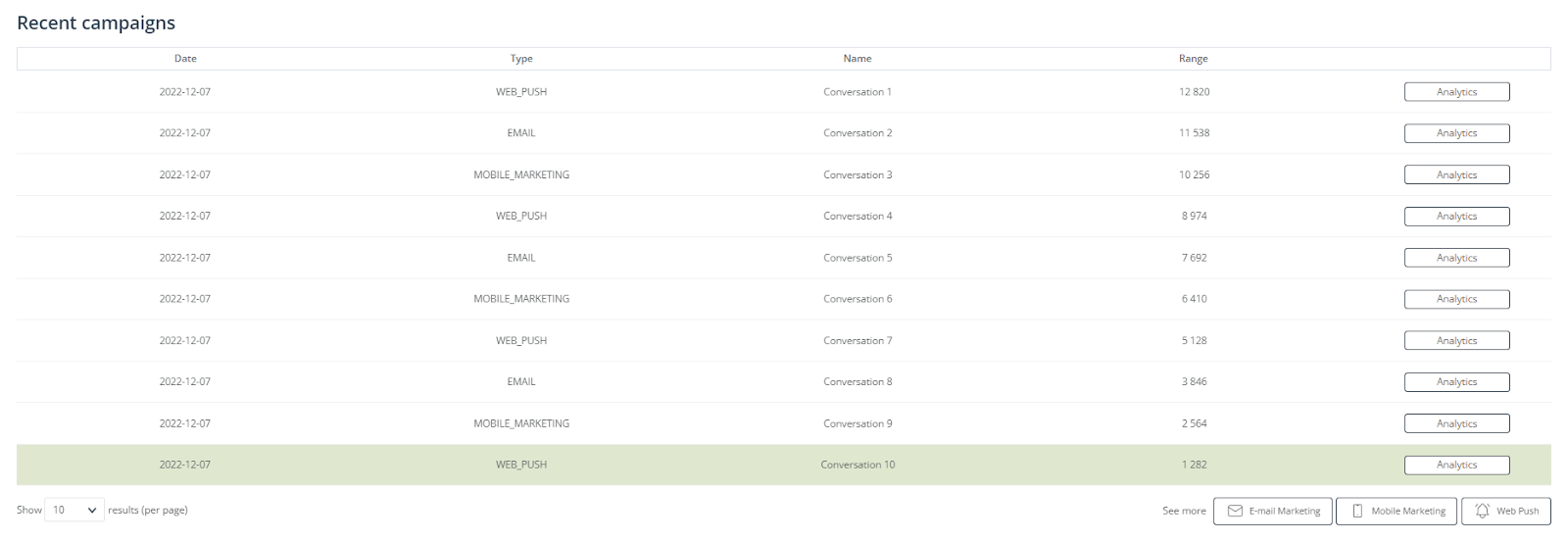
The Recent campaigns section includes a list of all mass communications sent to your audience, by order of recency, up to 3 months back. The items listed in this table can include the following:
- mass mailings and emails sent as part of A/B tests, including winning emails;
- mass Mobile Marketing messages;
- mass Web Push notifications.
Birthday, periodic, and subscription confirmation emails, as well as emails sent from Automation Processes or via API, are not included in this list.
The table presents the following data:
- date—the date when the communication was scheduled to be sent, by the user or (in the case of emails that won an A/B test) by the system.
- type—an indication of the marketing channel through which the communication was sent.
- name—the name of the sent communication under which it can be identified in the system (i.e., the name that is not visible to the recipients).
- range—the number of intended recipients.
To see the detailed analytics for a selected campaign, click the Analytics button in the right-most column.
3. Marketing uses
Here is how the Main Dashboard can help you maximize your marketing impact with Omnichannel Growth Intelligence:
- Observe which of your Automation Processes bring the highest revenue, and use this knowledge to refine the strategy of less profitable marketing campaigns.
- Learn from your past actions, check statistics for each individual Workflow and Automation Rule to spot the ones with the biggest impact.
- Measure the revenue generated through all communication channels and check what part of your total sales is coming from the automation.
- Compare the sales driven by and attributed to SALESmanago to the total sales in your eCommerce and check whether you are successively mapping, personalizing, and optimizing the path of each customer.
- Analyze the performance dynamics of email messages, SMS messages, and Web Push notifications, and check if you reach your marketing goals.
- Monitor customer activity to decide whether you should introduce any additional stimulation.
- Learn how effective your loyalty-building is. Check customer retention rates to know what activities and to what group you need to strengthen.