


Useful links
After setting RFM Marketing Automation, charts with collected data based on entered parameters are being generated. Here you can see how to set the RFM Marketing Automation;
To display charts for RFM Marketing Automation go to
AUTOMATION PROCESSES => RFM MARKETING AUTOMATION => DETAILS
Contents
- Recency
- Frequency
- Monetary
- Recency | Frequency
- Frequency | Monetary
- Recency | Monetary
1. Recency
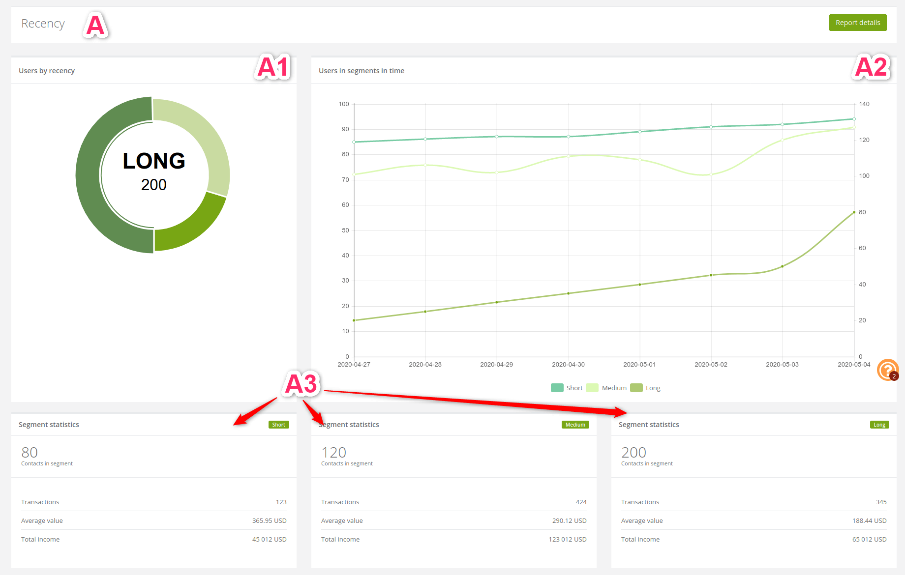
[1] Users by recency: the pie chart shows the number of active clients since the last purchase.
[2] Users in segments in time: the line chart shows information about clients recent activity in segments in time.
[3] Segment statistics: the statistics show detailed information about each recency.
Examples of how can we interpret the results:
- Knowing how much people recently bought our product we can compare It with the past,
- on statistics above we can notice that, lately more than a half contacts less bought our product comparing a long time ago,
- the difference between short and long total income is not as big but a number of transactions is almost three times higher in the short. We can assume that even though not much people recently buy our products they choose more expensive ones,
- medium recency has the highest transactions and total income rate even though the amount of the contacts is not that great,
- where a number of active contacts is not so high but the amount of transaction is, we can assume that one person had to make more than one transaction,
- It is worth to consider why in certain periods clients buy a lot but spend few, other times buy less but expensive things and why sometimes their activity decreases.
2. Frequency
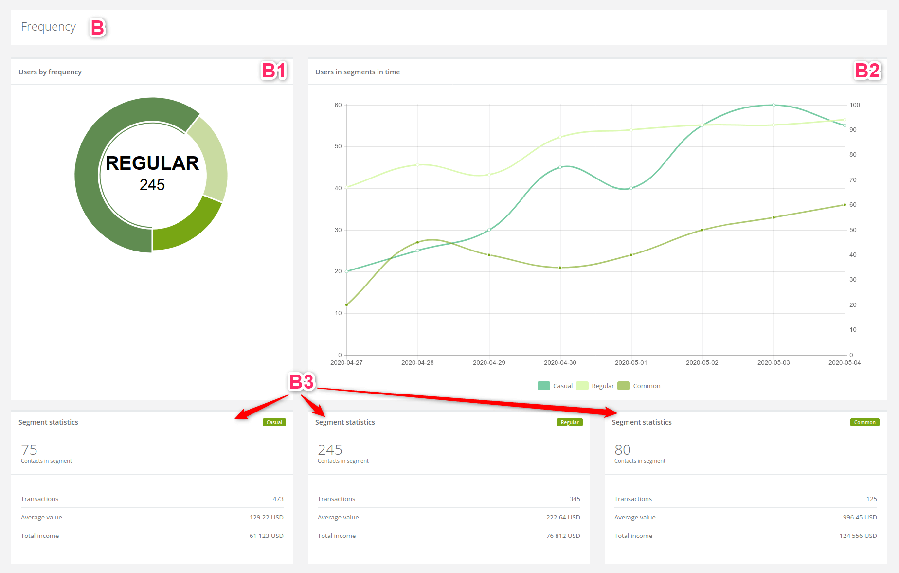
[1] Users by frequency: the pie chart shows the number of clients according to the frequency of their purchases.
[2] Users in segments in time: the line chart shows information about clients purchases frequency in segments in time.
[3] Segment statistics: the statistics show detailed information about each frequency.
Examples of how can we interpret the results:
- due to segmentation of purchase frequency, we can estimate the character of each group,
- from statistics above we can assume that even though the casual group is the smallest they make the most transactions,
- the same group is just five people smaller than the common buyers group,
- we can assume that casual buyer purchases a lot but spend few and the common buyer purchase few but spend a lot,
- the casual client spends two times less money than common client,
- even though the group of regular clients is a majority they generate not much higher profit than the casual group.
3. Monetary
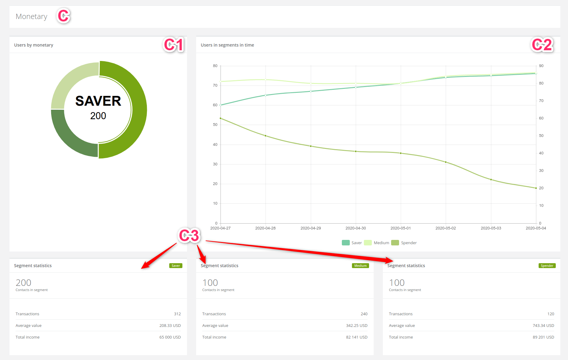
[1] Users by monetary: the pie chart shows the number of clients according to how much money they spend on our product.
[2] Users in segments in time: the line chart shows information about the amount of money spent by the client in particular time segments.
[3] Segment statistics: the statistics show detailed information how eager client spends money on our products.
Examples of how can we interpret the results:
- Knowing how eager clients spend money on our products defines them as a consumer. With that information, we can easier come up with tailored offer to their needs,
- from statistics above we can read that saver makes more transactions than medium or spender contact,
- we could encourage this kind of client with an offer to buy more expensive products,
- in this example spender and medium client spend the most but the highest average value has the first one,
- the fact that the medium client is not so far from the spender means he has qualities to become one and It is a good idea to focus on that.
4. Recency | Frequency
Matrixes compare data about clients and show accurate information about them. The numbers included in particular blocks are the numbers of contacts.
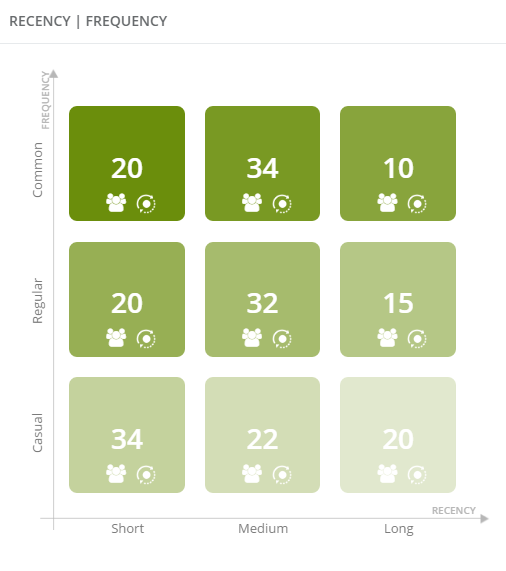
Examples of matrix interpretation:
- the highest number are the seasonal contacts who recently purchased the most, as well as customers who buy frequently, but last time purchased a product in the medium period of time,
- the least are regular customers that have not purchased anything for a long time,
- there are 20 of casual clients who bought our product long time ago, 20 regular clients who lately bought our product and 20 commons who also bought our product lately.
5. Frequency | Monetary
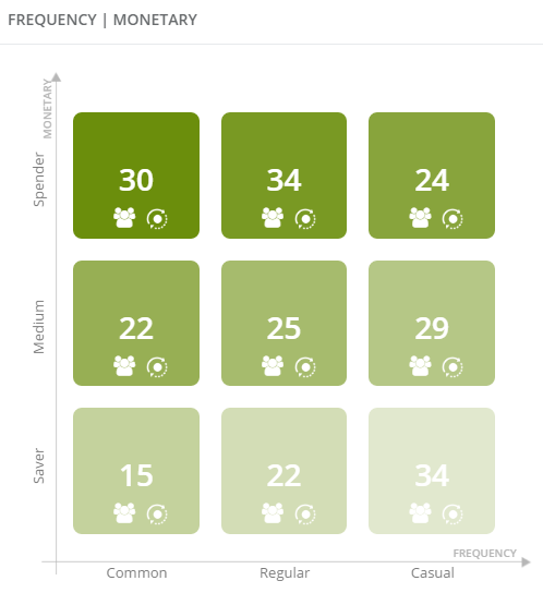
Examples of matrix interpretation:
- the most of the clients are casual savers and common spenders,
- the least of them are common savers,
- 22 are common medium and regular medium customers.
6. Recency | Monetary
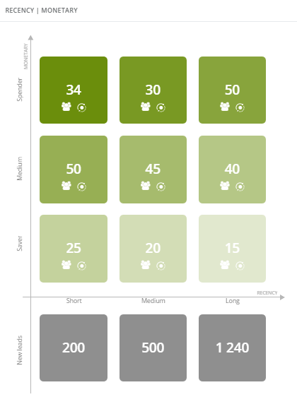
This matrix except previous data, contains information about the new contacts. The grey boxes are all obtained, in set before period of time, contacts, which did not make a purchase.
Examples of matrix interpretation:
- the most of the new contacts bought our product long time ago, the least in a short time and medium in a medium time,
- the most of the clients are medium that bought a product in short time and spenders that bought a product long time ago,
- the least are the savers that bought a product long time ago.
In particular blocks two icons display:
![]()
Clicking this icon we will be redirected to contacts list (contacts included in certain block).
![]()
Clicking this icon we can execute an action for certain group of contacts.
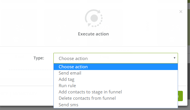
Depending on the action we would like to perform for the contacts we need to insert different settings. From this place we can:
- send email,
- add tag
, - run rule,
- add contacts to stage in funnel,
- delete contacts from funnel,
- send sms.