


Useful links
You can find a contact form widget while you work with our Drag&Drop landing page creator. This designer enables you to create pop-up templates, landing pages, thank you pages, etc.
If you want to create and design a template of a form in Drag&Drop landing page creator from the scratch, you need to start with creating its framework or, in other words, a layout. Then, you have to fill the structure with widgets, which are basic graphic elements of an interface. In this designer, you can select both standard and advanced widgets.
Here is an exemplary landing page which you can create in our Drag&Drop landing page creator:

In order to take advantage of the widget, you need to go to
LEAD GENERATION => LEAD GENERATION => LANDING PAGE
Contents
- Layout
- Widgets
a) field layout
b) settings
c) button - Advanced widgets
- Your widgets
1. Layout

[1] Layout – in this section, you can select one from seven kinds of layouts which in the next step you need to fill in elements which you can find in a Widgets section.
[2] Widgets – in this section, you can choose from a variety of elements which you will add to the layout, e.g. text, heading, image, button, etc.
[3] Advanced Widgets – in this section, you can find developed widgets.
[4] Your Widgets – this section includes ready-made widgets which you have created and saved.
2. Widgets

Contact form enables a user to subscribe and get into the SALESmanago system. The form can consist of any number of fields you like, which you can add after you go into its settings. You can ask the user about various information (e.g. contact details, personal details, the name of the company, etc.).
After you click  , you will be able to see the window below. There are three tabs in which you can change the settings concerning field layout, detailed settings of the layout and the appearance of the button.
[A] Field layout
In this section, you can choose one of three layouts.

Add a new field
Choose one of three field layouts which consist of columns. Then, in each of the column add a new field in which you can ask the user about various kind of information. You can choose pieces of information from the dropdown list next to Field name on contact card [1] (e.g. name, surname, address, postal code, country, etc.).
Additionally, you can add a Custom detail which you can display as a checkbox (in this field you can type in the content of the agreement to receive notifications).
Among available to choose between, there are fields such as Selection options and a Selection list. Choosing Selection options there is possibility of adding to the form radio buttons (the filed of single selection) and checkboxes (the field of multiple selection). The selection list (droplist) allows creating a drop down list with the options displayed in the form of the selection list. In this case there is also possibility of a single selection.
After you click Add new field, you will see this view:

[1] from a dropdown list choose the kind of information you want to ask the user in your contact form.
[2] the name in this field will display automatically once you choose the kind of information in the first field. It will be the same as in the first field. You can’t change this option because the information from this field will be mapped on the contact card of this user and you will be able to find it there under this particular name (e.g. if you choose Address, this information will be saved on the contact card under the name).
[3] in this section you can write a prompt for the user.
[4] tick it, if you want this field to be required.
IMPORTANT: Choosing fields Selection options and Selection list, the view of field settings screen displays a little bit differently.
The description below contains information about selection options notifications (radio button and checkbox) and selection list notifications:
[a] radio button
Adding the radio buttons to the form allows respondents to choose one of any given by you options available to choose between
IMPORTANT: chosen by the user option will be saved on the contact card as a detail.
The view of exemplary radio buttons on the form:
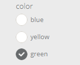
[a1] Selection type – this feature allows choosing one of 2 available selection option variants – in this case: radio button
[a2] Alignment – allows choosing radio buttons’ location on the form (to choose: left or center)
[a3] Detail name on contact card – type the name of the detail, which will be saved on the contact form including chosen by the user answer (saved as a detail value)
[a4] Field label– type the name of question, which will be displayed on the pop-up.
[a5] Edit elements – allows adding and then editing options to choose added by you
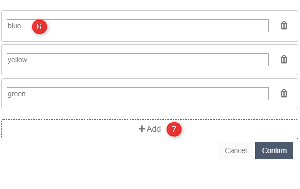
[a6] Selection field – possible options (answers) to choose between assigned to the given question. The option chosen by the user will be saved on the contact card. (the detail name should be typed in the 3rd point)
[a7] Add – allows adding more selection fields (answers)
[b] checkbox
Adding the checkboxes to the form allows the contact to have multiple selection of answers on the specific field. Typing the chosen data in checkbox settings you have to consider both the value and the detail of elements.
IMPORTANT: chosen by the user option will be saved on the contact card as a detail.
The view of exemplary check buttons on the form:
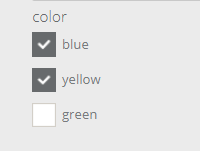

[b1] Selection type – this feature allows choosing one of 2 available selection option variants – in this case: checkbox
[b2] Alignment – allows choosing checkboxes’ location on the form (to choose: left or center)
[b3] Detail name on the contact card – type the name of the detail, which will be saved on the contact form including chosen by the user answer (saved as a detail value)
[b4] Field label– type the name of question, which will be displayed on the pop-up.
[b5] Edit elements – allows adding and then editing options to choose added by you

[b6] Item label (value) – possible options (answers) to choose between assigned to the given question. The option chosen by the user will be saved on the contact card. (the detail name should be typed in the 7th point)
[b7] Item identifier in the system (detail) – type the name of the detail, which will be saved on the contact form including answer chosen by the user (saved as a detail value)
[b8] Add – allows adding more selection fields (answers)
THE TIP: The view attached above shows an exemplary scheme, which should be followed while filling the relevant fields to add checkboxes to the form. The first field defines the field title on the contact form – in this case: colour, the detail will be the phrase indicating the choice – possible among the available options (it should contain the field title to correctly identify the answer to the given question) ex. colour_1→ represents choosing blue colour; similarly: colour_2→ here: choosing yellow colour. Thanks to this, the information including all the answers assigned to the given question will be placed in the details of the specific contact (in this case about colour).
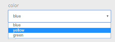
[c] Selection list (droplist)
Adding the field “selection list” just as in the case of radio buttons, there is a possibility of selecting only one option, with this difference that the given options will be displayed in the form of the drop list, not radio buttons.
IMPORTANT: chosen by the user option will be saved on the contact card as a detail.
The view of an exemplary drop list on the form:
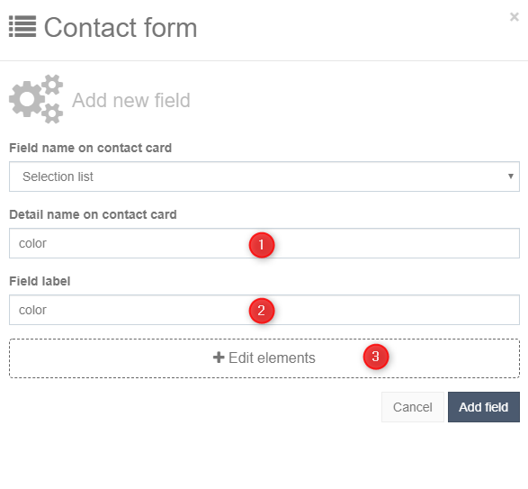
[c1] Detail name on a contact card – type the name of the detail, which will be saved on the contact form including chosen by the user answer (saved as a detail value)
[c2] Field label– type the name of the question, which will be displayed on the pop-up.
[c3] Edit elements – allows adding and then editing options to choose added by you
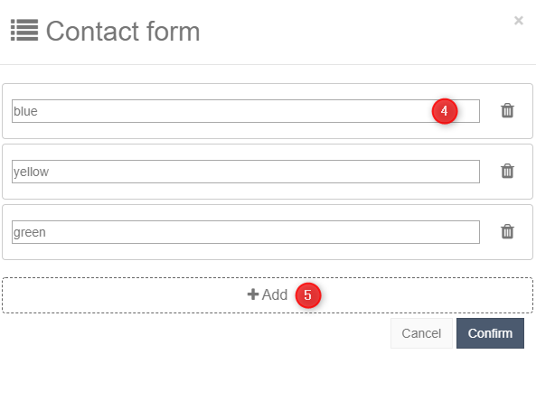
[c4] Selection field – possible options (answers) to choose between assigned to the given question. The option chosen by the user will be saved on the contact card. (the detail name should be typed in the 1st point)
[c5] Add – allows adding more selection fields (answers)
[B] Settings
In this section you can adjust detailed settings with regard to the field layout in the form.
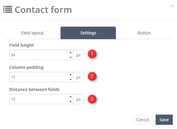
[1] adjust the field height.
[2] adjust the column padding.
[3] adjust the distance between fields.
[C] Button
In this section, you can customize the appearance of the button.

[1] type in any text you would like to display on the button.
[2] set the background colour of the button.
[3] set the font colour.
[4] adjust the border radius.
[5] choose the alignment of the button.
[6] adjust the height of the button.
[7] adjust the width of the button.
In Widgets section there are seven other, editable elements:

[1] Heading – after you drag and drop it in the layout, you will be able to type in any text which will display in the form of the heading.
[2] Text – it is a field in which you can type in any amount of an editable text.
[3] Image – you can upload any image in your form. In the settings you can also add a URL address, so right after clicking the image, the user will be redirected to this particular URL. Additionally, you can retain the original size of the image and adjust its margins.
[4] Divider – it separates the space within the form between the widgets. You can customize its appearance freely. It can take the form of solid line or dashed line. You can change its colour, size, length, top and bottom margin.
[5] Margin – this widget creates an interval in your form. Additionally, you can adjust its height.
[6] Button – it is a button which enables the user to subscribe. You can customize its appearance by choosing the colour of the background, the colour of the border, its height and width, its framing and the border radius. Moreover, you can decide where the button will be placed on the form.
[7] Social media – you can link your profile to social media (Facebook, Twitter, Google+, LinkedIn, YouTube, Vimeo, Pinterest, Instagram, Flickr, WordPress, Tumblr, WeChat and Youku)
3. Advanced Widgets
In this section, you can find developed widgets.

[1] Image + Text – it is a combination of an image and a text. You can choose the image from gallery or upload your own.
[2] Product frame – you can add a product frame in which there will be displayed recently viewed products by the contact. You can choose the type of a recommendation ( AI Recommendation or recently viewed products by the contact), the background colour of the frame and the maximum amount of products displayed in a row.
[3] Menu – you can add your own menu to the form. Settings enable you to change the font.
[4] Banner – you can upload your own banner here. Choose an image from the default gallery or upload your own. Additionally, you can retain the original size of the image and adjust its margins.
4. Your widgets
In this section, you can make use of the ready widgets which you have created and saved.

Once you’re done, click Save and continue.